As CSS allows increasingly complex designs to be implemented, and with much more cross browser support for even some of the latest features, it seemed the right time to take on a CSS art challenge. With the second part of the latest season of Rick and Morty now airing, after watching an episode I thought that doing some Rick and Morty related would be a nice challenge.
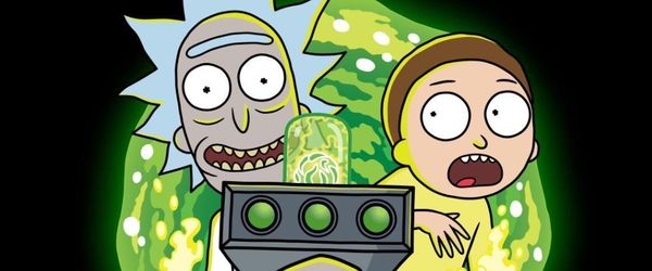
After a quick search on CodePen, there are a few other attempts at Rick and Morty characters, however they have generally significantly simplified the characters. Therefore I have set myself the challenge to get as close to the following image as possible:
In order to create the final image, I created five separate CodePens:
- The Portal
- Rick Sanchez's Head
- Morty
- Portal Gun
- Everything Together + Rick's Body Holding Gun
In the sections that follow I'll detail the approach taken, and explain any elements that were particularly tricky, with the aim of covering all the main concepts that anyone would need to create their own Rick and Morty. Getting the detail and sizing as close as possible was very time consuming. I'd estimate that the total time taken to be in the region of 30-35 hours.
I'm assuming basic knowledge of HTML and CSS such as adding borders, usage of :before and :after, absolute positioning. Also, CSS variables are used, such as var(--ricks-mouth).
TL;DR:
The following techniques are used:
- Radial gradients for teeth, gun lasers, portal bubbles and portal swirl effect.
- Hack of the borders, using border transparent on two sides and a border colour on another to create a point. Use for hair and bottom of the portal gun.
- Lots and lots of borders on divs with border radius, absolute positioned and rotated on the Z axis using transforms.
- Three layers of text, each with different text-stroke size and colour for the text. Along with absolutely positioning and rotating each letter.
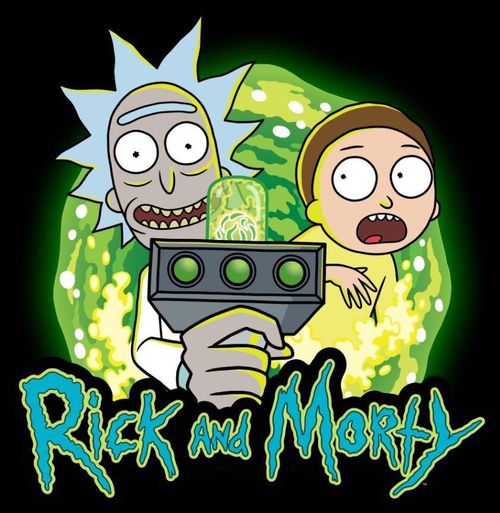
Here's the completed CodePen and source code.
Step 1: The Portal
Due to the portal containing lots of bendy, curvy, rounded lines and shapes I wasn't convinced initially that I could create a reasonable portal. I therefore started on the portal, as I didn't want to get all the way to the end to find I'd have to use an SVG to make anything that's half decent.
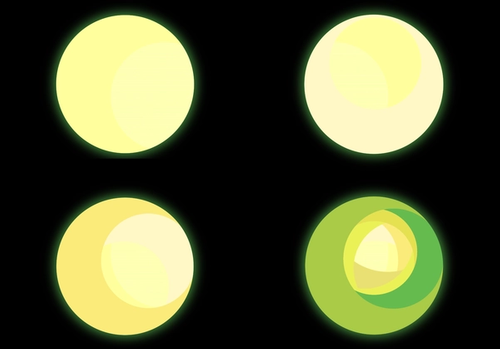
After some playing around, I found the best effect was to draw lots of circles, using radial-gradient, over the top of each other. Radial gradients work in the following way:
background: radial-gradient(<shape> at <position>, <color> <size>, <color> <size>, ...);For the portal effect, an initial small circle is drawn with a bright yellow colour, and then going to a slightly darker, yellow, slightly towards green in hue. Subsequent circles are then draw over the top, getting slightly larger in size, and with varying offsets, for the overlapping effect, but also with the main centre circle being transparent, only the outer has colour:
.portal {
  background:
    radial-gradient(circle at 49% 35%, transparent 40%, #FFF8C5 37%),
    radial-gradient(circle at 79% 59%, transparent 40%, #FFFE9C 37%),
    radial-gradient(circle at 50% 50%, #FDFEB4 100%, #FDFEB4 100%)
  ;
}
If you imagine taking 30 pieces of card, the first card being light yellow in colour and having a small hole in it, and then with each piece of card the hole gets larger and darker in colour until it's green. Then you stack these on top of each other, each one moved slightly, leaving the other holes slightly out of view. That's exactly how this effect is built up.
The following image shows this layering being built up.
For additional effect, "bubbles' have been draw using a light yellow colour. These are just tiny radial-gradients, with colour in the middle, and transparent on the outside. This prevents the rest of the portal from being covered up.
See the Pen CSS Portal - Rick and Morty by Nick Taylor (@nicktayloruk) on CodePen.
Step 2: Rick Sanchez
See the Pen CSS Rick Sanchez - Rick and Morty by Nick Taylor (@nicktayloruk) on CodePen.
Creating Rick was relatively straightforward, the trickiest bit to get right was the hair and the mouth. Which I'll go into more detail on.
Mouth
If you look closely you can spot that the top left and top right of the mouth is very slightly flat
Here's what's happening:
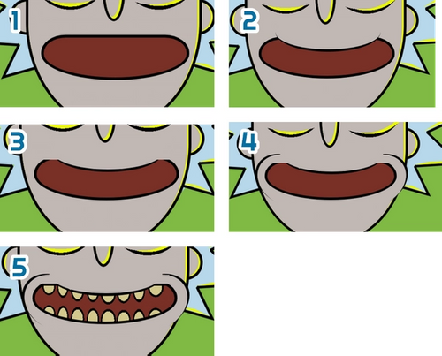
Step 1
Creation of a div, with rounded corners, with the bottom left and right radii being around 60%. In order for the corner to not be uniform, it uses two parameters.
/* How it works */
border-bottom-left-radius: <bottom-radius> <left-radius>;

/* Example: These produce the same result */
border-bottom-left-radius: 10px;
border-bottom-left-radius: 10px 10px;

/*
Example:
Folowing the bottom line across to the left, the border's bottom line
will start bending 30px from the bottom left corner.
Following the left line down, the border's left line will start bending
10px from the bottom left corner.
*/
border-bottom-left-radius: 30px 10px;
Step 2
A second div is created with a border radius for the bottom left and bottom right, with only a border colour and width for the bottom line. The background colour is set to the colour of Rick's skin, and then moved over the top of the mouth, in order to produce the concave effect for the top of Rick's mouth.
Step 3
Two rectangle blocks are placed over the top left and top right of the mouth, background colour of Rick's skin, in order to take the harshness of the corners away that are apparent in the Step 3 image.
Step 4
Create a block with a border left, with large radius, with Rick's skin colour as the background to create the lip/cheek outline. These are then transformed and rotated on the Z axis. Repeated in an opposite fashion for the right lip/cheek outline.
Step 5
The teeth are added using radial-gradients, one radial gradient for each tooth. Each tooth starts off with the colour of the tooth, for 16% of the width of the mouth, then changed to black immediately at 16%, until 20%, and then from 20% onwards the gradient is transparent.
This essentially produces a circle that's got a solid colour in the middle, with a black outline. The critical part here is the transitions of colour being 0% i.e. tooth colour ends at 16% and the outline colour starts at 16%.
Note that these also have a different height and width (the first two parameters in radial gradient below) for a more oval appearance. Then the gradients are positioned so they are on the edge, hiding half of the oval.
background:
  radial-gradient(20% 150% at 20% 89%, var(--rick-teeth) 16%, black 16%, black 20%, transparent 16%),
  radial-gradient(23% 110% at 10% 80%, var(--rick-teeth) 16%, black 16%, black 20%, transparent 16%),
  radial-gradient(23% 110% at 10% 80%, black 20%, var(--rick-mouth) 20%);
Hair
Each of the hair spikes is created in the following way:
- A div with a black background, with rotateZ transform to get the hair into position.
- A :before on the div with content: '' set and display: block set, set with the border colour of Rick's hair.
- An :after on the div with content: '' set and display: block set, with a border colour of the highlight and a rotateZ transform to get the highlight into position.
For steps 1 and 2 above, the pointiness of the hair is created using a border hack, this is explained best in this CSS Tricks article.
Eyes
The eyes are simply a div with a border radius of 50% to create the circle. The eye balls are a tiny div, with a :before and :after, of tiny width and height, which are then rotated to create star shape.
Note: These stars are absent from the CodePen above, and the Morty CodePen below. These were added in the final stages when I was cross checking everything against the original image.
Step 3: Morty
See the Pen CSS Morty - Rick and Morty by Nick Taylor (@nicktayloruk) on CodePen.
The trickiest part of Morty was the hand due to the fingers and shape of hand. The main body of the hand is a very rounded div, with a straight div placed over the top and over to the left to make the arm.
Each finger is an individual div with no border-left, but with large border radius for top-right and bottom-right.
Hair and Head
The hair and head are created as divs with large border radii. The lime coloured highlight was created by adding overflow: hidden to the main containing div, the background colour of which is the highlight colour. The use of :before is then used, with a height and width of 100% and set as the colour of the hair, this is the moved slightly by adjusting the top and left properties, which then exposes the highlight colour underneath.
Step 4: Portal Gun
See the Pen CSS Portal Gun - Rick and Morty by Nick Taylor (@nicktayloruk) on CodePen.
Now that we're this far through the process, there's no new techniques here, however, here's a quick breakdown of more notable areas of the portal gun.
Portal Glass
Rounded rectangle with a background colour which has alpha transparency, so that when it is overlaid over the top of Rick's face, it will look as though the glass is tinted.
Portal Ball in the Glass
One div for the ball, which has outer shadow on the finished article to soften the end (not seen above). The inner flecks are seven divs with different heights, widths, rotation on the Z axis and various border-radius values.
Underside of Portal Gun
This was a little tricky due to the direction of the shadow underneath. This was achieved by creating a trapezium shape in dark grey, using the same border technique to create points in Rick's hair. The only difference is the border-left and border-right aren't big enough to create a point and therefore create the trapezium shape.
This is then repeated for the light grey, however this has a smaller width, leaving the light grey trapezium displaying underneath it.
Portal Laser Beam Circles
Created using 50% radius on divs with a radial-gradient, transitioning between three different shades of green and different stages:
background:
    radial-gradient(
      circle at 65% 19%,
      var(--portal-gun-beam-one) 0%,
      var(--portal-gun-beam-two) 50%,
      var(--portal-gun-beam-three) 100%
    );
Step 5: Putting It All Together
See the Pen CSS Rick and Morty by Nick Taylor (@nicktayloruk) on CodePen.
We're almost done, the next step was a simple copy and paste job into one document, and then moving each character into the approximately correct position.
Rick's Body and Hand
There were no new techniques used for Rick's body and hand, it was just very time consuming. I think the hand alone took about 4 hours, due to a lot of moving, adjusting, and manipulating the 14 block elements it took to create it and get the size orientation right.
Completing the Portal
Now that all the main components were in position, Morty's bottom of body and arm needed covering up with bubbles from the portal. This was created using a layer sitting over the top, with a higher z-index, so that the bubbles were in front of Morty, but behind the title.
Each of the bubbles are individually positioned and sized radial-gradients, created in the same way as the teeth but without the outline, as I didn't want the bubbles to have a uniform darker colour around them. The result effect was created with over 150 bubbles, and therefore over 150 radial gradients.
Compared to the portal CodePen created initially, the colours have been adjusted to be closer to the promotional image. As well as this the edges have been softened by allowing a gradient of about 1% between one colour and the next, as shown in the example below:
/* From this: */
radial-gradient(circle at 79% 59%, transparent 40%, #FFFE9C 40%),

/* To this: */
radial-gradient(circle at 79% 59%, transparent 40%, #FFFE9C 41%),
Rick and Morty Title
The title uses a free font called 'Get Schwifty' by jonizaak. In the original portal CodePen the text was not close enough to the promotional image. Therefore I did the following:
- Split each character down, by putting it into a 'i' tag within a 'span'.
- Using nth-of-type select each letter, size, position and rotate it on the Z axis.
The 'i' was required inside the 'span' for sizing purposes due to 'ems' being used for size. Changing the font-size in the span changes how top and left values are used in the positioning calculation, and therefore rather than just adjusting the top and left using the previous letter's position, you'd be starting from scratch again. I'll likely do a blog post about ems, rems and pixels in the future.
That's a Wrap!
This was incredibly enjoyable and extremely satisfying seeing it all come together bit by bit. The result was much much closer to the original promotional image than expected. I dare say with another 10-15 hours of work it could get even closer by drawing many many times more bubbles to create the wavy portal rather than the straight lines of the radial-gradient, as well as sorting those flat edges on Ricks mouth!
So, now you know all the basic techniques, give it a go yourself, I highly recommend it if you have some time on your hands. Patience is a must though. Enjoy!