After years of using preprocessors such as SASS and LESS for variable support, CSS variables (Custom Properties) are finally supported sufficiently enough such that I feel comfortable in using them for new projects. According to caniuse.com, support of CSS variables currently stands at 95.13%.
I understand ~4.9% of people will not be able to get a good experience using the site based on this statistic, however it is important to look at the current statistics of your/your client's site and see what technologies are actually being used. What I have found certainly for some sites, is that the figure is closer to 98%. This might well be an acceptable range for the site you are working with. There are also ways to manage the support issues, and I'll cover these towards the end of the post.
Advantages of Using CSS Variables by Example
At a high level, CSS variables work in a similar way to variables in SASS or LESS, however they come with the extra added benefit of being able to be changed by a container, and this is what I see as the biggest advantage over the preprocessors.
If you haven't used variables in either of these before, what it allows is for you to give a value a name, so you can set '--main-color' to 'yellow', and then use that in other parts of the CSS document, for example:
:root {
--main-color: yellow;
}
.my-component {
background-color: var(--main-color);
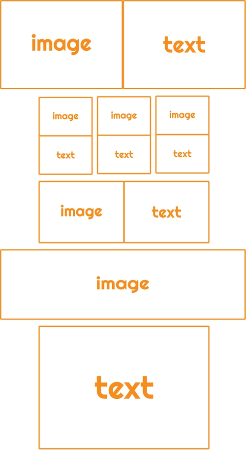
}To help save time in building your web site, you want to break down the design in to reusable components. For example, an image with text next to it, whether the image be above, below, left or right of the text, can appear multiple times within a design.
The following example shows an example simple page layout:
NOTE: When I talk about a "text" area here, I mean it in the context of a rich text area, where you can add headers, change styling, add a button and other simple components into the text itself.
If you deconstruct each of the components (hero, three columns layout, text only block etc.) text areas, there are typically a few set differences that may occur with each text area:
- Text size
- Background colour
- Text colour
- Outer padding
- Inner component spacing
It'd therefore be nice if we could develop one component that could be used in each of these sections, without reinventing the wheel whenever one of these properties need changing slightly due to them being part of a hero, or column layout.
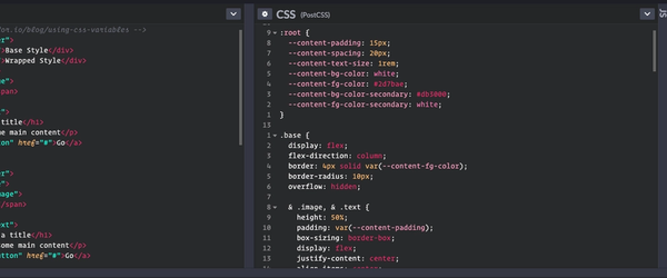
The following CodePen shows an implementation of a text/image block, one which is the "base" with default styles set globally in the :root and then a "wrapped" style, which I will then walk through. Note that PostCSS has been used here to support nesting CSS, which is currently proposed as an editors draft.
See the Pen Using CSS Variables Example by Nick Taylor (@nicktayloruk) on CodePen.
Within this example, the main content variables are set against :root.
:root {
  --content-padding: 15px;
  --content-spacing: 20px;
  --content-text-size: 1rem;
  --content-bg-color: white;
  --content-fg-color: #2d7bae;
  --content-bg-color-secondary: #db3000;
  --content-fg-color-secondary: white;
}
These would become the base styles wherever the --content-* variables are used within a component. So, in the CodePen example above, these are used in the base styles as follows:
.base {
  border: 4px solid var(--content-fg-color);
  ...

  & .image, & .text {
    padding: var(--content-padding);
    ...
  }

  & .image {
    background-color: var(--content-fg-color);
    ...
  }

  & .text {
    font-size: var(--content-text-size);
    background-color: var(--content-bg-color);
    color: var(--content-fg-color);
    ...

    & > * {
      margin-top: var(--content-spacing);
      ...
    }

    & > .button {
      --content-bg-color: var(--content-bg-color-secondary);
      --content-fg-color: var(--content-fg-color-secondary);
      --content-text-size: 1.2em;
      --content-padding: 15px;
    }
  }
}
Providing that between the document root and the base component the --content-* variables aren't changed in any way, the element with the 'base' class will take on the :root variables. So in the example above the 'image' and 'text' class will have a padding of 15px, taken from the :root declaration by default.
We have also set up some base styles for the button:
.button {
  display: block;
  background-color: var(--content-bg-color);
  color: var(--content-fg-color);
  padding: var(--content-padding);
  font-size: var(--content-text-size);
}
However, you will note that in the 'base' class for the main component, we have overridden the --content-* styles for the 'button' class:
...
    & > .button {
      --content-bg-color: var(--content-bg-color-secondary);
      --content-fg-color: var(--content-fg-color-secondary);
      --content-text-size: 1.2em;
      --content-padding: 15px;
    }
...
This means that for this particular component, the button will not take the styles from those declared on the :root, but from the ones defined by the component.
The beauty of this is that the button component can be completely isolated and use the default --content-* values whenever they are used on the on the page. They can then be overridden by the parent component where necessary but without the parent requiring knowledge of the internal structure of the component i.e. what span, or divs are inside in order to have its padding overridden. You could completely rewrite the button component, using the --content-* variables, without having to go and change the overriding styles in any parent component.
Finally, this then also means you can change the components theme if you add it to another component. This can be seen in the 'wrapper' class definition.
.wrapper {
  --content-text-size: 20px;
  --content-padding: 30px;
  --content-bg-color: white;
  --content-fg-color: #db3000;
  --content-bg-color-secondary: #2d7bae;
  --content-fg-color-secondary: white;
  ...
}
The wrapped 'secondary' colours defined would always be complimentary colours to the main component colours, which can then be used within sub components as a contrast. The final effect in our simple example is that the colours have been inverted and font size and padding changed.
As you can see, this is a huge benefit over the preprocessor approach as the values can be changed dynamically by parent at runtime.
If you are using React or Vue, there are theme based solutions to aid with this handled by JavaScript, however I like the purer approach, I'm always a fan of moving to native CSS as much as possible. Currently my use of PostCSS is limited to features that you find at least as a CSS working draft.
Managing Compatibility
If backwards compatibility is really an issue for you, then you first need to decide how big of a problem it'll be for your users. If it needs to work identically across the board then I'm afraid, for now at least, you'll need to continue with your current approaches.
There are a few things that can be done, which all have different levels of impact to your users.
Use Sensible Defaults
This is probably one of the simplest ways to achieve what you are after. What you are doing here is setting the value for, for example, padding first as a fixed amount, and then directly underneath setting it again using the CSS variable:
.component {
  padding: 15px;
  padding: var(--content-padding);
}
Post CSS
With PostCSS you can force this to replace all CSS variables with the values it finds, however, this doesn't work for the examples above. It only works in a more SASS / LESS type way, where the work is done upfront and therefore variables cannot be affected by their parent. At least you are making a step towards a more pure form of CSS.
Recommend the User Switch Browser
This isn't always a nice one to do, however if your numbers are very low on the browsers that don't support CSS variables, then I'd still recommend this one. By continuing to support old browsers, we reduce the justification for getting people to upgrade.
I'd suggest that you request they change to one of the supported browsers, but also provide relevant contact information for the company (depending on the type of business), so the user can always ring or email if necessary. Keep the message nice and friendly :-)
That's a Wrap
Whilst I realise that preprocessors will be around for a while yet, I think it's good to push forward with the latest tech where practically possible. I completely understand the need for backwards compatibility for some businesses, however I think it's also important to give people a nudge to use the latest browsers.
With Edge now using Chromium under the hood, and most browsers auto updating you, it's exciting to know that soon tech that's released one year, might be able to be widely used the next. After years and years of messy backwards compatibility CSS, this is great news for front end developers, this is the dream anyway.